The colors used in trial graphics vary greatly. Here we will dive into the psychology behind colors and how, when, and why certain shades should be used in the courtroom.
Understanding Color Psychology
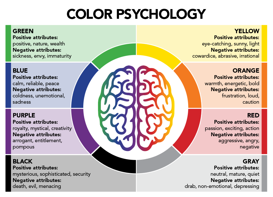
Color can evoke an emotion, create a negative or positive impression in a juror’s mind, help focus the narrative, and clarify a position. It is important to note that there is no such thing as a bad color—only the misuse of a color in certain situations. Every color comes with positive and negative associations, and understanding color psychology and using it effectively in trial graphics will only strengthen your argument.
We created Figure 1 below to synthesize the color psychology research.
Considering the Cultural Background of Your Jurors and the Trial Venue
Cultural differences can cause different impressions about color. For example, red in Chinese culture conveys good luck, wealth, and prosperity, but is often used in Western cultures as an indicator of aggression or negativity. White is often associated with purity and innocence—such as at a wedding or a baptism—but in some cultures, white relates to death and is associated with burial shrouds. While your trial location will most likely favor Western sensibilities, do not discount the cultural factors jurors themselves may bring to the trial. Jurors rely on their own life experiences to make judgments and are more likely to agree with an argument if it reflects their own value system.
Environmental and contextual factors can also play a role in color psychology. A black dress at a cocktail party is viewed as elegant and sophisticated, but a black dress at a funeral indicates grief or sadness. A rural town may more likely associate green with agricultural issues, while in an urban location, green may more often relate to financial issues.
Colors in Trial Graphics
Studies suggest that people who are shown color images commit their content to memory more often and for longer periods of time than the same images in black and white. It is no coincidence that the vast majority of commercial ads are in color—marketers know that ads in color are read 42% more often than the same ads in black and white.
Example 1: Same Graphic with Different Colors Creates Different Meanings
For this fictitious trial, the trial attorney is trying to showcase the predatory nature of Company A (Figure 2). As you can see, red is an extremely good choice of color to portray the aggressive nature of the company as it seems to spread menacingly over the country. Yet when you change the markers to green as in Figure 3, the nature of the graphic has shifted. The color in this graphic is now communicating company growth and expansion—a much more positive message for viewers. The same graphic with different colors can create different meanings.


Example 2: Matching Color to the Message
In this fabricated case, the trial attorney wants to indicate that a negative test result on a medical exam was a good outcome. The inclination is to use red to indicate a negative result (Figure 4). However, this leads the jurors to a confusing emotional path—you are telling them the results are good but indicating a negative outcome through color. By reinforcing the positive emotion with color, you can lead the jury more easily down the narrative path (Figure 5). Even better, by rewording the trial graphic and using a color associated with reliability, you can limit the Stroop Effect (Figure 6) and create a congruent meaning between the color and the text, conveying more reliability and assurance to the juror.


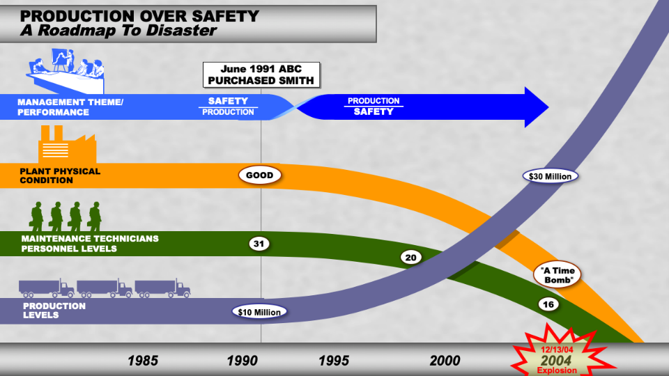
Example 3: Color Coding for Consistency
Corporations have long known how important color consistency is for brand recognition, which is why many companies will actually trademark certain colors. By the same principle, color is also useful as a narrative tool to keep similar ideas, themes, parties, or witnesses coded to a specific color (Figure 7). In this example, color coding the four main case themes (management, plant condition, maintenance, and production levels) helped to reinforce those themes throughout this trial graphic and helped to draw jurors’ focus through consistent imagery. The simple use of these four colors by counsel as a counter to complex scientific concepts from opposing counsel was the difference in defending this plant explosion.
In Conclusion
Color can be a powerful tool for your argument, so the more you understand color psychology, the more effective your trial graphics will be. Let your case, your client’s story, and your trial venue guide your color selections.
A version of this article was also published on Law360.com.