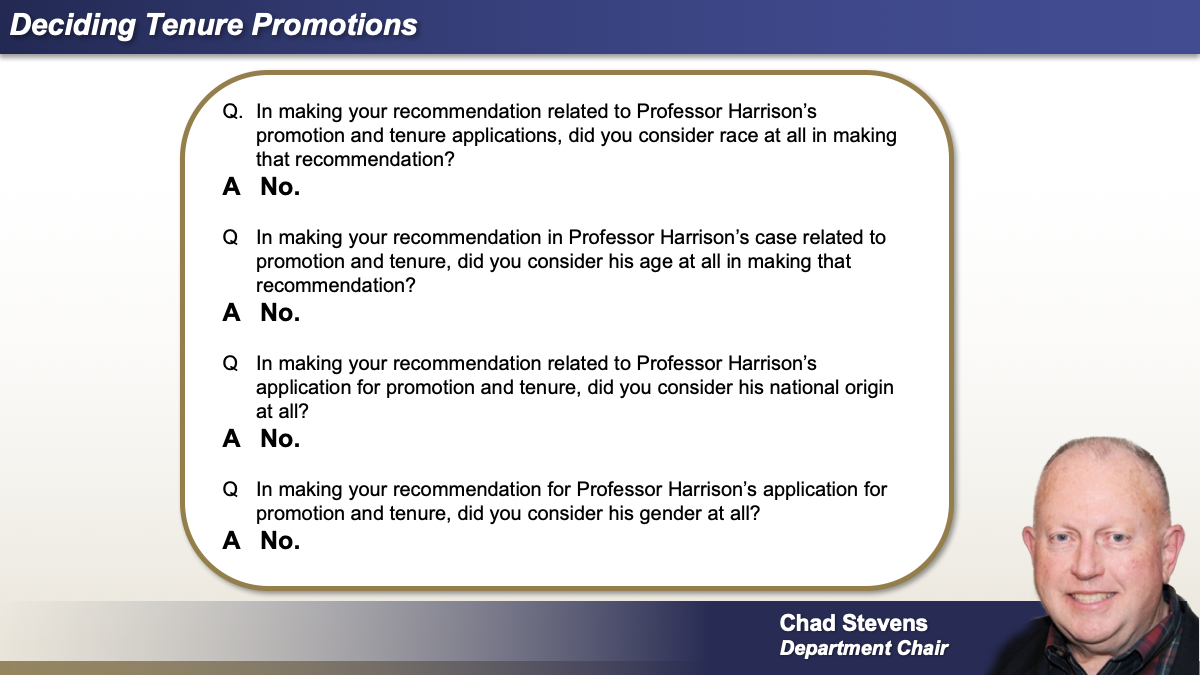
Parts 1 and 2 of this series explained how and why jurors’ communication styles—and, accordingly, their responses to trial graphics—have changed with the influx of new media. So, what can you do about it?
By sticking to visual communication fundamentals and making tweaks with the modern juror in mind, your trial presentation can successfully reach, and resound with, all generations.
Changes to Your Trial Graphics: Subtle, But Crucial
Twenty or so years ago, the concept of bringing tech into the courtroom was considered too flashy. Times have certainly changed. We have established that today’s jurors expect polished visual elements in your case because they see polished visuals every day. To demonstrate how well-known graphics can be tweaked for today’s media landscape, we will review a few examples.
Example 1: Checklists
Checklists have been and will continue to be powerful, simple, and crystal-clear tools for reaching any audience. They are the definition of “tried and true.” Traditionally, an attorney might stand in front of the jury and write out the checklist on a pad of paper. Over time, that pad of paper was replaced with a basic PowerPoint slide that might include a modest use of color and icons (see below), perhaps to denote “good” (green checkmark) or “bad” (red X).
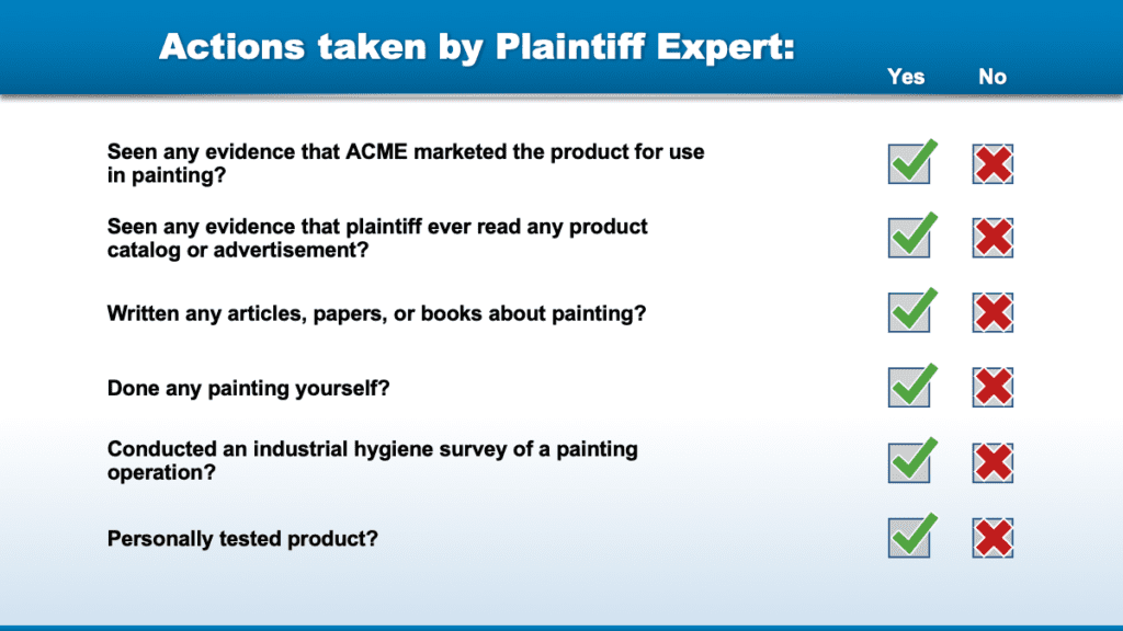
In the following image, we see how a checklist can be subtly updated to reflect how jurors now recognize information. While the graphic is by no means busy, the viewing experience is jam-packed with understated techniques.
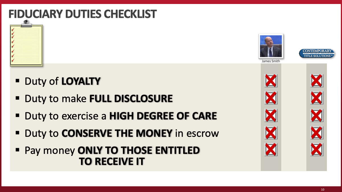
Keywords are bolded, capitalized, and/or colored, thereby highlighting the most important pieces for rapid intake. A portrait of a key player is added to match the image/text expectations of your average modern webpage. Lastly, a “checklist” icon is provided to immediately clue the audience in to the graphic’s purpose.
While the stark simplicity of the first checklist graphic may appear preferable in some ways, current jurors are used to the appearance and style cues of the second example. Anything less can feel dated and is easy to tune out.
Example 2: Headlines
As we previously discussed, media (both social and news) now takes a “headline” format. Quotes and information often come in soundbites and one-liners. Consider this example from a news segment:
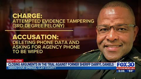
(Source: Action News Jax)
The content still resonates with older generations, but the design has the brevity and flair to which younger generations have grown so accustomed. Note the stylistic choices: the use of color, the icon, the large text, and the even larger subject image, all without cluttering up the screen. Here is how that style can influence our trial graphics:
For one, the speaker in this second example is immediately apparent. We have a much bigger portrait than we would have considered in years past, but the larger image matches viewers’ expectations and connects with our case themes and our desire to humanize the client. We also bolded key responses and made use of a catchy, thematic slide header.
Example 3: Data Trends
In the earlier days of trial graphics, demonstrating a data point trend might look a little like the example below. You could put the numbers in a table showing how, for example, ACME’s cash on hand was shrinking over time. Or, if you were feeling adventurous, you could put together a basic timeline demonstrating the downward slope.
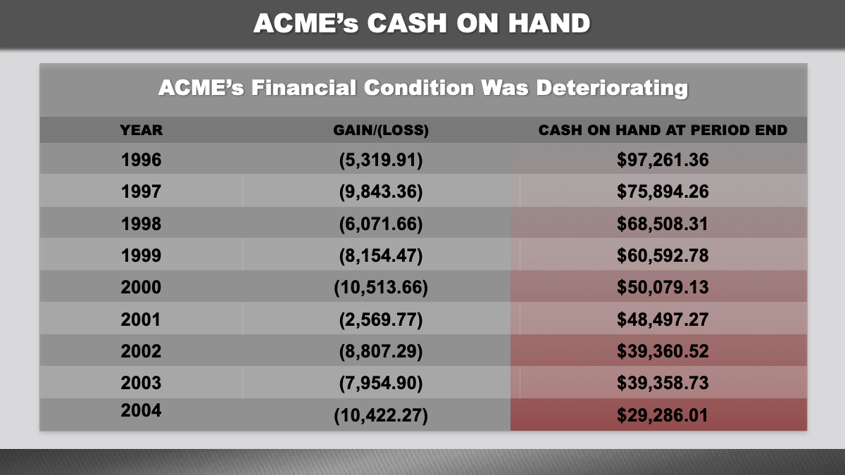
Nowadays, representing data in that fashion likely would be met with tears of boredom. You will need to take a page from modern infographics to keep your audience interested and to help jurors quickly draw the right conclusions.
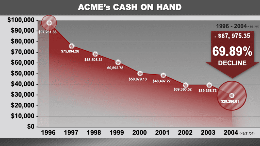
The differences between examples 1 and 2 are almost palpable. This second graphic invites the viewer to zone right in on the circled beginning and end points and watch how ACME’s cash deteriorates over time. Moreover, a large red arrow icon summarizes and capitalizes on the point, highlighting in large text the percentage of the decline. Color is used boldly to denote financial loss and guide the viewer’s eyes to the most important sections of the image.
Example 4: Timelines
The following modernized timelines also use subtle techniques to point jurors’ eyes where we want them. New media relies on attractive images to grab one’s attention, so we do the same. Colors, icons, and short-but-sweet text keep it interesting while making our case points. Each title uses its heading power to cement the graphic’s core theme, as a title always should.
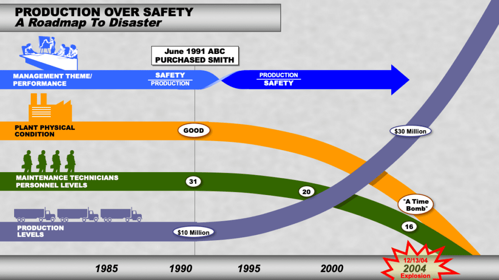
In the above example, colorful lines (each with a corresponding icon) show the moment that safety at this particular plant began to take a backseat to production levels. Jurors see the plant’s physical condition and the number of maintenance technicians declining while production increases—a counterintuitive notion demonstrating our opponent’s irresponsible practices. The trend inevitably leads to a plant explosion, fittingly represented by bright red spikes. Likewise, in the next example, services rendered soon fade from good to bad.
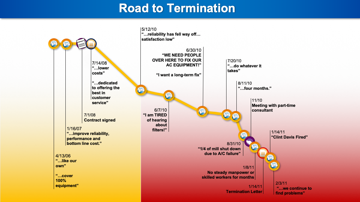
Each data point connects to a bite-sized quote, linking the evidence—in small, digestible pieces—to our chronology. Observe that the coloring reinforces our argument; jurors can witness the exact point at which quality drops off (and continues to decline).
Finding the Right Balance for the Modern Juror
The examples above reflect the evolving ways in which jurors take in information. But what may not be readily apparent is how graphics weather the inevitable balancing act between a judge and opposing counsel—a tightrope walk between what is allowed and what will be most effective with jurors. If your opponent objects to one graphic successfully, and your PowerPoint is full of similar slides, you have just lost your whole slide deck. Keep that in mind.
Graphics such as the news headline example would generally be objected to in court, while our modified headline example shoots for a similar style but is toned down enough to be acceptable. Of course, make sure you do your homework about how the judge in your particular case strikes that balance.
In Conclusion
Speaking of balance, the goal of this three-part series is not to suggest everything you present needs to be in the form of a special graphic. Variety is extremely important to hold the jury’s attention. There is an art to understanding how much is too much and knowing when to put down the clicker and just speak to the jury, or when that big pad of paper and a few colored markers might be exactly the right tools for the job.
But when you do use graphics—and you should, often—be mindful of the effect that new media has had on your jurors. In the end, even older generations have been influenced by the major shift in media and information acquisition. Younger jurors certainly do not know a world without sophisticated visuals and videos.
When you are crafting trial graphics, it is important to walk before you run. Start with fundamentals to ensure more positive results, then hone each graphic to a fine point by using the tips above and by staying up to date with how your audience expects to receive information. And remember, as technology continues to shift over time, attorneys must be prepared to adapt to the evolving multimedia that new generations will have at their disposal.