In short, jurors aren’t enamored with the insurance industry, and these negative sentiments can make your insurance defense case an uphill battle. How do we know that? We carried out a nationwide poll to learn more about juror attitudes toward insurance companies. While our findings varied, a general pattern of skepticism and negativity emerged.
The good news is that unfavorable opinions don’t have to be a death sentence for your case. Aside from the ultra-important jury de-selection stage, developing powerful themes and telling a relatable, memorable story can give your case just the boost it needs to counter bias.
To tell such a story, it’s imperative that you incorporate well-tailored graphics with strategic purpose. Graphics have a unique and powerful role to play when you’re up against a tough jury.
Bringing the Policy to Life
If jurors soundly understand the framework of the insurance policy and the related law, the influence of their emotions—and your opponent’s emotional appeals—diminishes. But, because policy documents can be so lengthy, confusing, and dull, you must find visual ways to keep the jury interested in and attuned to your story. Below are a few options.
Tastefully Add Animations
Animations are great but certainly not in all forms. Flashy text and images flying on and off the screen can be distracting for jurors. Instead, use animations to simplify. The policy is complicated enough, so offer information in bite-sized pieces for effective, step-by-step storytelling. Building as you go keeps jurors focused on your commentary and prevents them from reading ahead or becoming overwhelmed.
This effect is often accomplished by zooming in on important language from a larger document. For example, if the policy in question underwent numerous revisions, each click could zoom in on the language of a different revision so you can more closely discuss the terms you understood to be final.
Incorporate Colors and Icons
Colors and icons are another tried and true organizational tool and are very easy for jurors to recall. Both can be used to (again) simplify—reducing clutter and wordiness and differentiating parties, themes, etc. You can then use these same distinctions moving forward so jurors have quick, shared reference points in your case, which creates helpful sign posts and bookmarks for jurors’ later deliberations.

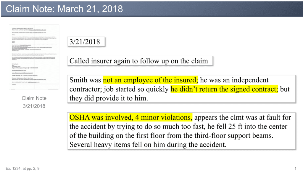
In Figure 1, we see two examples of document callouts. On the left, a yellow outline indicates language discussing the type of coverage, while on the right, a blue outline indicates language discussing OSHA violations. This method helps add variation and emphasis without muddying the message.
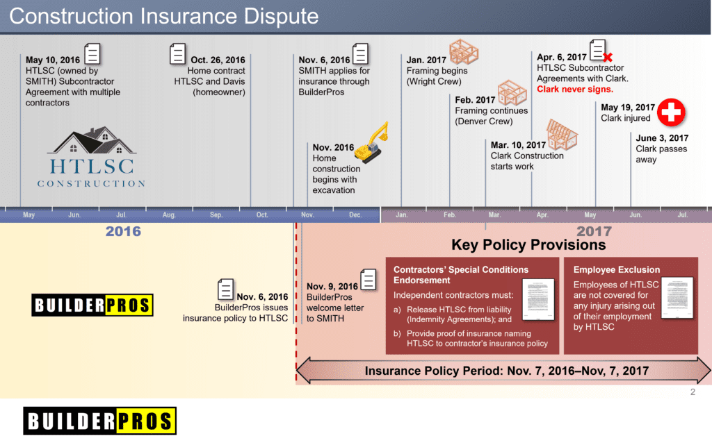
The imprint value of your message is inversely related to its complexity; each graphic needs to be concise and easy to understand.

The timeline graphic above (Figure 2) tells the story of an insurance dispute involving a policy that required all independent contractors to release the builder from liability. The contractors were required to provide proof of insurance before any work was performed. A worker was fatally injured on the job, and it was discovered that he had been allowed to work without the necessary proof of insurance.
Because the majority of entries were accomplished with icons and very little copy, the key provision language fit nicely on screen as part of an animated sequence.
Humanizing the Insurance Company
In our polls, jurors expressed some significant concerns about insurer motives and ethics. For this reason, humanizing the insurer is a must. The goal is to separate jurors from any mental images they might have of some massive, faceless profit machine. Graphics play a large part in doing just that.
Individuals Who Make Up a Whole
Start with the basics. Emphasize the positive, human element of your company. This can include showing a few pictures of real people at work for the insurance company, and perhaps the people who were directly involved in negotiating or servicing the policy at issue.
You could also supply some information about how many people the company employs, how long it’s been in business, etc. Break down the company into its individual parts so it doesn’t seem like an unrelatable monolith.
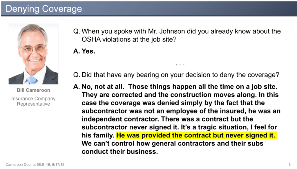
Later on, include testimony slides with pictures of each deponent. This will add that same personal touch to the testimony and can bolster your witnesses’ credibility (See Figure 3 below).

There’s No Such Thing As a “Perfect” Company
Infallibility is an extremely difficult position to take and tends to come off as artificial. Humans make mistakes. Your opponent is going to pitch a lot of accusations, and, in most cases, there are areas where the company could have performed better.
So, instead of trying to prove your perfection against the barrage, try to embrace apparent negatives—it can take the edge off the accusations, give you more control over the message, and, most importantly, feel sincere to the jury. Above all, be proactive. The key is to show that when you do make mistakes, you take responsibility and work to correct them.
You can also come back with testimony or evidence demonstrating your company’s commitment to ethical practices and its track record of correcting any mistakes or oversights. A simple checklist can be effective here: one by one, you can highlight the lawful and/or ethical actions in which your company engaged.
Conclusion
Because so many jurors harbor negative feelings about insurance companies—but not all with attitudes extreme enough to strike them for cause—even a case that feels like it should be fairly straightforward can run into a jury with a bone to pick. With the right case themes and tactical graphics that fortify those themes, you can break down biases and get the jury focused on the merits of your case.
Let us help you brainstorm themes and graphics for your next insurance defense case. Contact us today to get started.
View this article on The National Law Review here: How To Combat Juror Attitudes Toward Insurers With Visual Aids (natlawreview.com)


